
One of the goals of Left 4 Dead's art direction was to capture the tone and feel of being right in the middle of a horror movie. This meant making the environments look scary in a specifically cinematic way. To achieve this, we adopted four distinct "filmic" effects for our art direction: color correction, film grain, vignette and local contrast. We'll walk you through all four techniques, with examples, below.
Color Correction
Color correction helps simplify the game's color palette without sacrificing utility. In other words, we drained the color out of certain areas of the environment to get a stark, moody tone, but made sure eye-catching and gameplay-specific elements (like health packs, blood and exit points) still popped onscreen: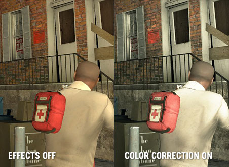
Film Grain
Left 4 Dead is more frightening in a dark and shadowy environment. We found that applying a film grain technique heightened this feeling, both in helping to make the cinematic experience as gritty and authentic as possible, and in how effectively it implies a greater detail to the surrounding darkness than is actually there.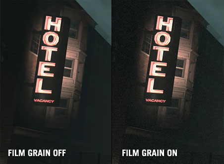
Thanks to playtesting, we also found that if we applied the film grain effect uniformly, people got tired of it fast. So we tweaked the technique. Consequently, in very dark areas with a lot of shadows, there's a lot of film grain visible. But the brighter an area gets, the more the grain fades into the background, and disappears entirely in very bright areas.
Vignette
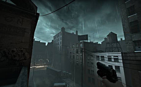
A third film effect we experimented with was vignetting. This is a lens artifact you'll often see in lower budget films where cheap cameras were used: specifically, dark edges seeping in around the edges of the screen. Even still, there's such a thing as too much. As you can see, we only applied the effect around all of the top edges of the screen, so a player wouldn't feel like they were looking through a telescope.
A little goes a long way — as it appears in the game now, playtesters didn't feel like it intruded at all. It also did a good job of softening the top edges, focusing the gameplay downwards to the center of the screen, where you want a player to look.
Local Contrast
The final technique used in Left 4 Dead was local contrast. This is a technique borrowed from photo retouching, where the contrast is adjusted specifically on areas of an image that contain a high level of visual detail. This technique helped make the visuals sharper and more focused.
This ended up being great shorthand for us, as it effectively imitated the feeling of an adrenaline rush or near-death experience. The effect gives the player a sense of heightened perspective, and was a great subliminal way to let them know a zombie attack was coming.
Visual Cues to Gameplay
Left 4 Dead's AI Director means that every time you play it you get a unique experience. Zombie attacks, music cues and even the narrative are generated on the fly based on your health, ammo, and how you're playing. Essentially, the AI Director changes your game experience as you play.
Our approach to art direction followed the same path—we wanted to ensure a player got a visually unique experience every time he or she played, based on their performance. Using the four effects we explained above as a foundation, we were able to dynamically blend them to dramatically alter the tone in key areas of the game.
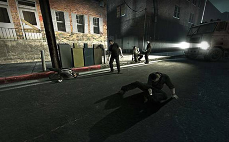
One example of this is the "third strike" — what we call in-game when a player has lost almost all of their health twice, and is on his or her last legs. We've increased the level of vignetting to simulate tunnel vision, maxed the color correction to suck the color from the shot, and used local contrast in an inverse manner to soften the edges.
The accumulative effect of all these techniques is to make it look as if the player is bleeding out. This, again, is a great visual shorthand. When you see this in the game, you don't need to be told that you're pretty close to death.
Pain pills are another example of a visual cue. In the game, a player can give him or herself a temporary health boost that will slowly drain away over time. In this instance, we've maxed out the local contrast, taking what is usually a subtle technique to imply heightened senses, and making it temporarily overt:
That's all the space we have for now. In Part 2, "Stylized Darkness," we'll talk about our approach to lighting the dark and murky world of Left 4 Dead, with a focus on playable, stylized dark — namely, finding a balance that gives a player the illusion of darkness without getting frustrating.
Aesthetics, fiction and gameplay: these are three criteria that we always consider when employing a new art direction for a game. With a game as dark as Left 4 Dead, this meant having to figure out a lot of new ways to use the absence of light to our advantage.
Here's a sample screenshot from an early version of the game.
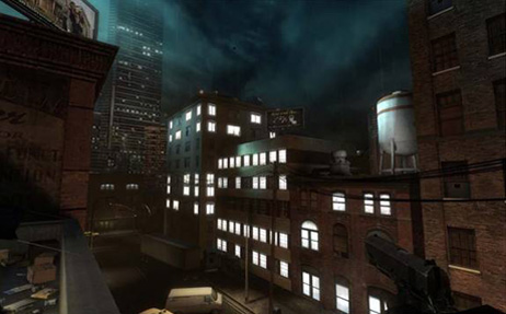
From an aesthetic standpoint, this is the wrong atmosphere for a horror game. It's too bright. From a narrative standpoint, it detracts from the fiction we're trying to create: if the player's in the midst of a zombie apocalypse, how come everything looks so unaffected by it? Why do all the buildings still look occupied?
Most importantly, though, this screenshot fails from a gameplay standpoint. There are too many light sources to give the player any useful navigational clues. In other words: it's not telling you where you should be heading. Let's look at the same screenshot with simplified lighting:
From watching many playtests, we found players instinctively moved towards well-lit areas. Simplifying the lighting helped the gameplay (the player is drawn to the warm glow down the street, and not distracted by unnecessary light sources); the fiction (this entire city block's been abandoned—something's not right here); and the aesthetics (by simplifying the visual information, we've given a focal point for the eye to follow).
Getting Inventive With Lighting
Left 4 Dead's setting is a post-apocalyptic wasteland just before nightfall. As mentioned earlier, this meant constraints in terms of the light sources we could use without hurting the gameplay, fiction or aesthetics. This forced us to get creative: what lighting would you realistically see in an abandoned city overrun by zombies?
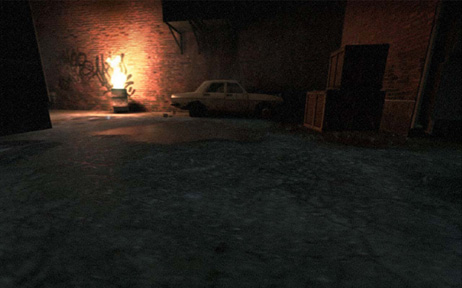
Car headlights are a perfect example. They tell a good visual story, implying a sense of abandonment. When you see a car with its headlights on and nobody around, it's clear something's gone wrong:
Make that an abandoned police car, and it's clear something's gone very wrong:
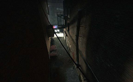
On the aesthetic side, car headlights are a low light source. This was a big plus, since it meant a lot of long, dramatic shadows. To help gameplay, we placed the cars at intersections where we wanted to direct players or lead them around obstacles.
Silhouettes
Designing Team Fortress 2 taught us a lot about how important silhouettes are. Clear character silhouettes helped players get distinct reads in an instant, giving them the information they needed to make important snap decisions in a fast-paced environment.
But while TF2 had a bright and colorful art direction, Left 4 Dead takes place in a variety of dimly lit nighttime environments. Because of this, playtesters weren't able to see zombie silhouettes in the midground and background. Because of this, they were repeatedly getting mobbed.
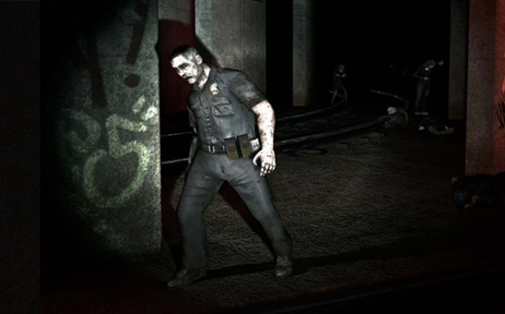
While sudden zombie attacks were inarguably scary, they were also frustrating—players weren't being given the information they needed to react. They wanted that "Here they come!" moment, and we weren't giving it to them. The solution? Light-colored fog:

While not as realistic-looking as actual fog in some settings, it meant playtesters could see attackers in the distance. Once they were able to anticipate attacks, playtesters started to have a much better time.
The Player as Light Source
Flashlights, like car headlights, were a great way to light the game without contradicting the game's fiction. Even better, we found that by making the flashlight weapon-mounted, the light is just slightly off-center at all times. This created interesting shadows and helped make zombie attacks much more dramatic. From a gameplay standpoint, gun-mounted light sources also had the interesting side effect of disappearing when you reloaded or shoved zombies back.
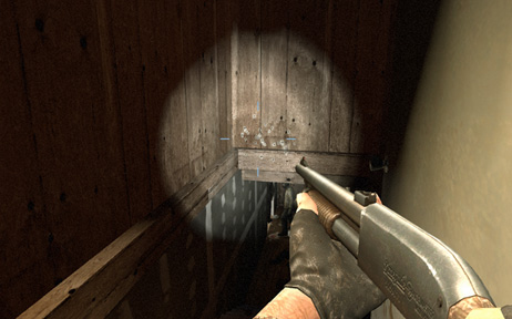
This gave both actions a sense of consequence, and encouraged players to stick close together because they didn't want to be left alone in the dark when reloading.
Self-Shadowed Normal Mapping
Normal mapping is a graphics technique that lets game developers create the appearance of detail on surfaces without additional geometry. Normal mapping could, for example, make a brick wall appear to have depth without having to use a lot of geometry at the sake of performance.
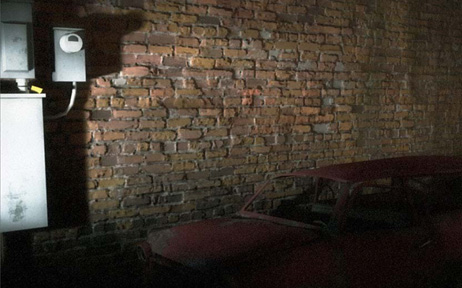
Self-shadowed normal mapping takes this technique to the next level. Not only do the bricks look bumpy-they also cast shadows upon themselves, creating a better sense of realism. Using self-shadowed normal mapping had a dual benefit: It really helped the visuals pop in a game dominated by flashlights and darkness; and, after doing the code work, didn't end up sacrificing any more performance than regular normal mapping.
Specular Surfaces (Wetness)
One final technique that we used in Left 4 Dead was the use of Specular Surfaces, or wetness. In horror movies, you'll find dark settings are almost always wet. Wet surfaces create highlights, they create parallax-they create an atmosphere.
Specular Surfaces worked great with our Self-Shadowed Normal Mapping technique. Wet surfaces imply more detail. Even in a shadowed area, the glint off a wet brick wall implies a greater amount of detail on a surface that would otherwise look blank. Aesthetically, this made environments feel that much more bleak and miserable. Narratively, they implied how decrepit these abandoned areas had become. Wetness also helped gameplay, as a way of counteracting the darkness. In many cases, having a wet surface behind a zombie helped pop its silhouette, just as if it had been standing in front of fog.
We hope you enjoyed this brief look at the thought process behind the art direction in our games, and the importance of playtesting in our decision-making process.


